One app and two websites — connected by reusable components
When the government needed 3 digital products in 3 months with zero existing baseline, the only viable answer wasn't a design — it was a system.
In January 2017, Mexico's SFP — Secretaría de la Función Pública — came with an unusual brief for a government agency: design two websites and one mobile app from scratch, in three months.
On paper it sounded like a resourcing problem. In practice it was something deeper. Three separate teams would be designing simultaneously, across three different product contexts, with no shared components, no existing brand system for digital, and no time to build one before shipping.
The real constraint wasn't the timeline. It was that none of the three products could afford to wait for the others.
The brief had two hidden dimensions: three teams designing simultaneously, and a consistency requirement that made ad-hoc decisions impossible. What the project actually needed wasn't a designer — it was a system architect.
The instinct when building a design system is to finish it before you start the products. Define every token, document every component, agree on every rule — then hand it off.
That instinct would have killed this project. Three months didn't allow for sequential thinking. The system had to be built alongside the products that would use it, with each team's real-world usage driving what got documented next.
I'd seen this tension before at Scotiabank. The lesson there was the same: a design system doesn't finish before the first product. It co-evolves with it. The moment I reframed this as infrastructure rather than deliverable, the entire approach shifted.
That reframe also meant finding my Pareto law for this system: what was the 20% of components that would give me 80% of adoption? I needed a lean approach — start only with what the real products actually required, then iterate from there.
What shipped was not a perfect system. It was the right system for these three products at this moment — and that distinction turned out to matter more than perfection.
Before designing a single component, I needed to understand what type of products these three actually were. Benchmarking wasn't about visual inspiration — it was about identifying the interaction patterns that would need to scale. The insight that emerged: all three products were fundamentally multi-step form experiences. That single observation defined everything.
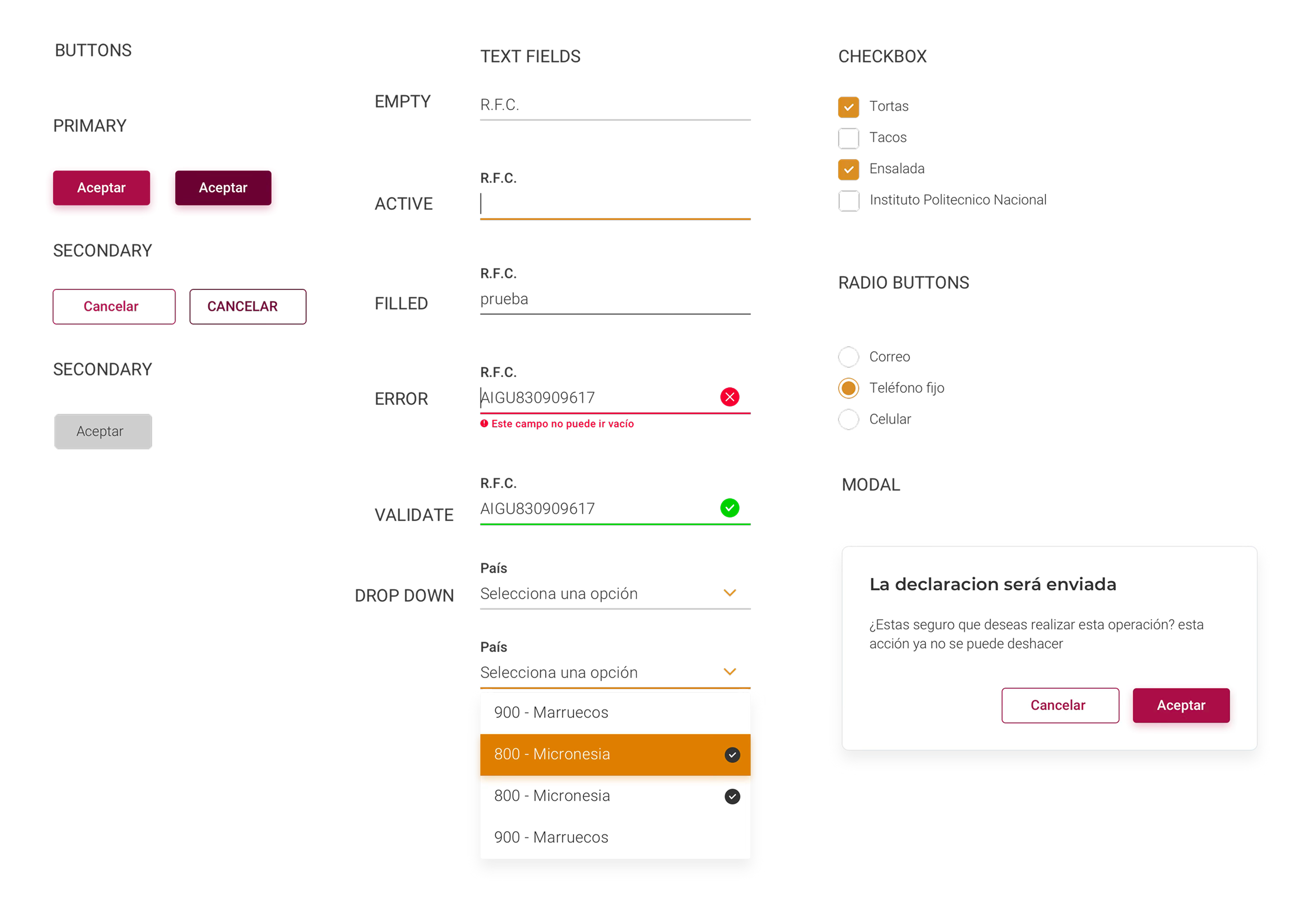
Not a complete system in Figma. A minimal set of components — buttons, form fields, modals, steppers — injected directly into the three real products. Components were defined with full context: not just what they are, but when to use them, why, and what variations exist. Real usage revealed gaps that hypothetical design never would have.
Three teams designing simultaneously from the same source of truth. When a team wanted a new component variant, it had to be documented and added to the system — no ad-hoc decisions. The constraint felt like friction at first. By week three, it was the fastest way to make decisions: "Does the system have this? If not, should it?"
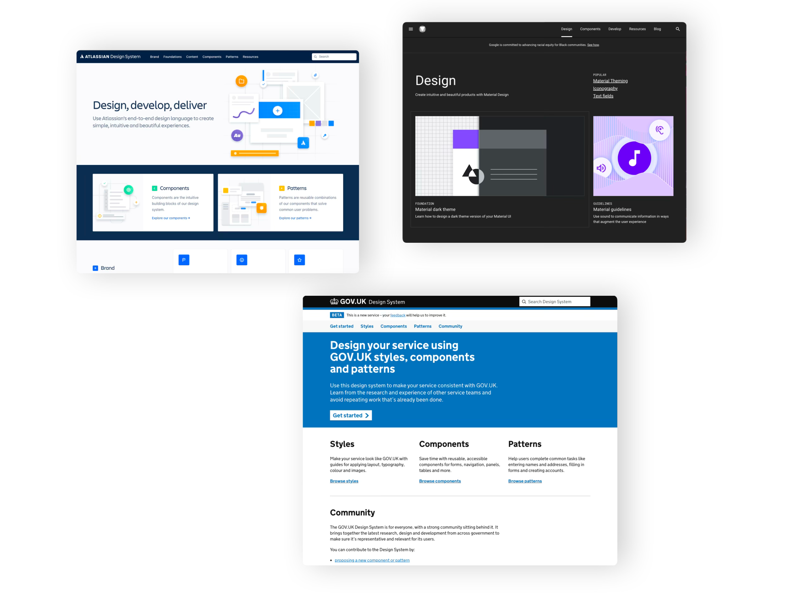
Benchmarking here wasn't about finding visual inspiration. It was about understanding how other systems had solved the same underlying challenge: forms and data collection at scale, with a wide range of user sophistication.
Each reference contributed something specific — not a style to copy, but a design decision to understand well enough to either adopt or deliberately reject.
Strong grid systems, bold typographic hierarchy, and zero decoration. A government service doesn't need to be beautiful — it needs to be unambiguous for users with low digital literacy.
The lesson wasn't Material's visual language — it was how systematically it documented component states: empty, active, filled, disabled, error, validated. Forms live and die by state clarity.
Each component was documented not just visually but functionally: control, trigger, menu, context. A design system that developers can't implement precisely is just a style guide.
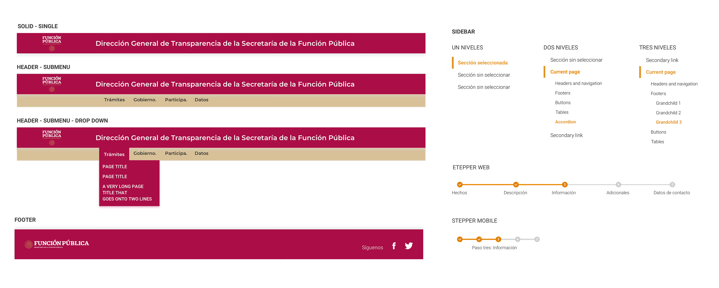
The branding decision was deliberate: reuse over reinvention. The SFP already had a color palette (the official gob.mx scheme) and a logo. Rather than redesigning the identity, I extended it — adding typography and formalizing the digital token system.
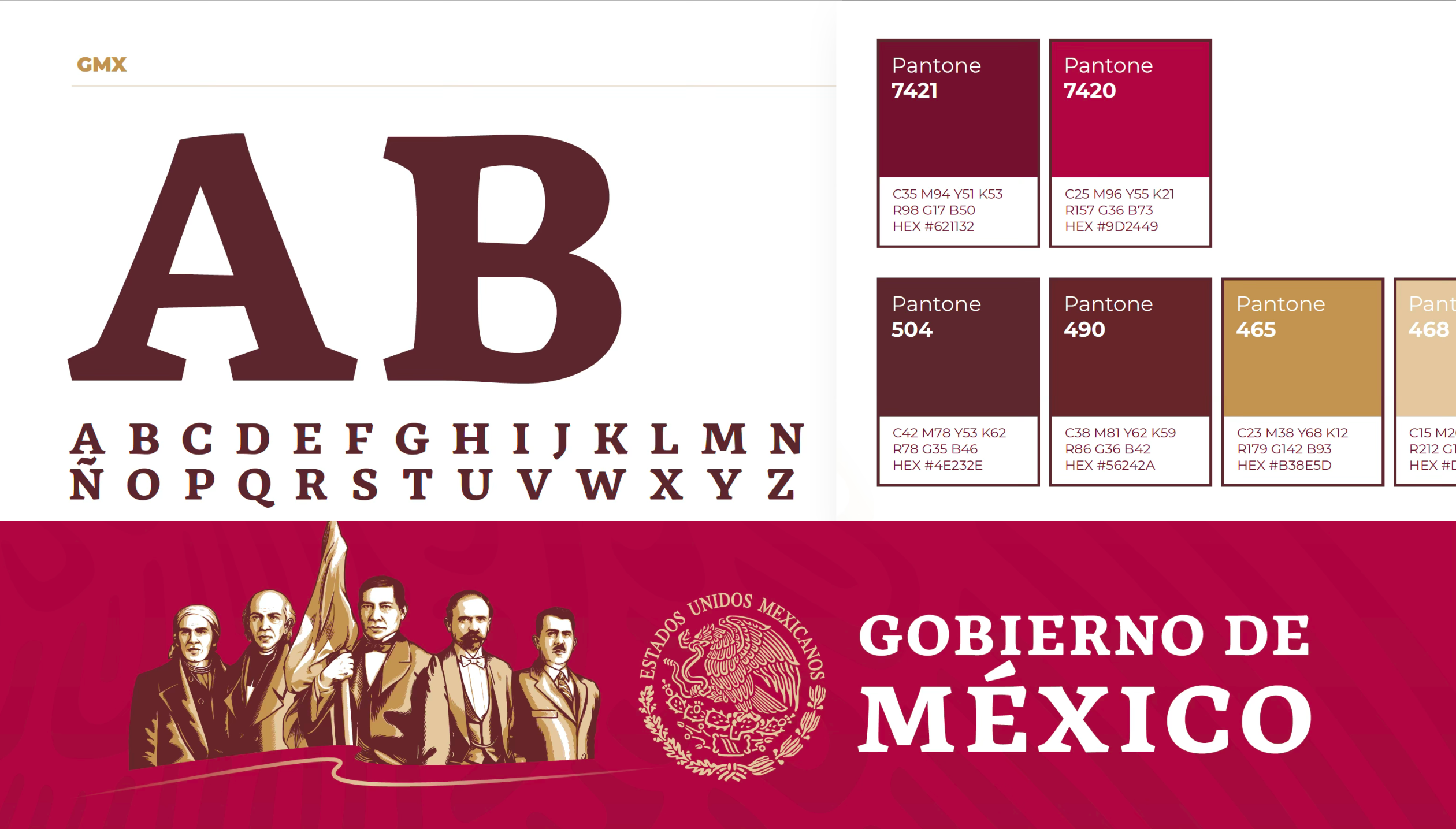
Montserrat for headings, Roboto for body text. Both open source, both already in use across Mexican government digital properties. This removed a decision without sacrificing quality.
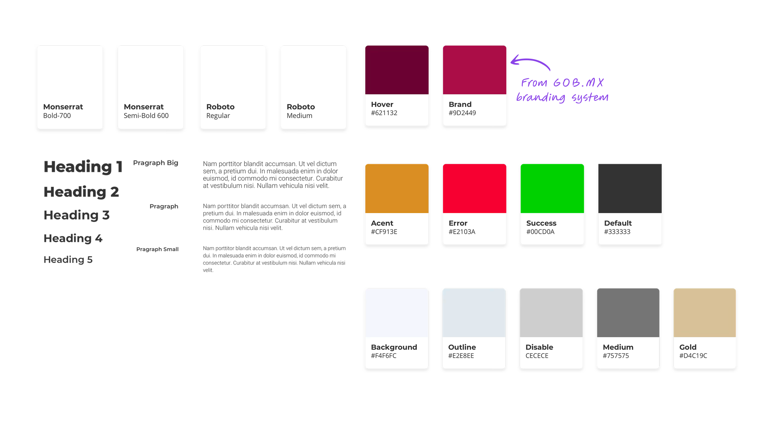
Most component documentation answers one question: what is this? The Publik system was documented to answer three: what is it, when do you use it, and what are all the states it can be in. That third question — states — is where most teams were losing consistency in practice.
When a developer knows every valid state explicitly, there is no room for interpretation. The design decision is already made. Disagreements about "how this should look in the error state" don't happen because the spec already has that answer.
From the start there was a pattern that kept becoming more obvious. Denuncia Ciudadana collects reports. Trabaja En collects applications. Denuncia Paisano collects anonymous tips. All three products were, at their core, information collection machines. The surface-level differences — civic reporting vs. job search vs. mobile anonymity — were real, but they didn't change the underlying interaction model.
The pattern became obvious by looking at the products from below — from the component level up — rather than from the brief down.
The practical consequence was significant: optimizing the form components once meant optimizing all three products simultaneously. A better text field validation pattern improved Denuncia Ciudadana, Trabaja En, and Denuncia Paisano in a single change. That's what system-level thinking looks like in practice.
If the system had been designed top-down, from an imagined "complete" spec, this pattern might never have been seen. Building revealed what the brief wouldn't have.
The real test of a design system is not how it looks in a library — it's whether the same components can answer different design problems without needing to be rebuilt. These three products proved it could.
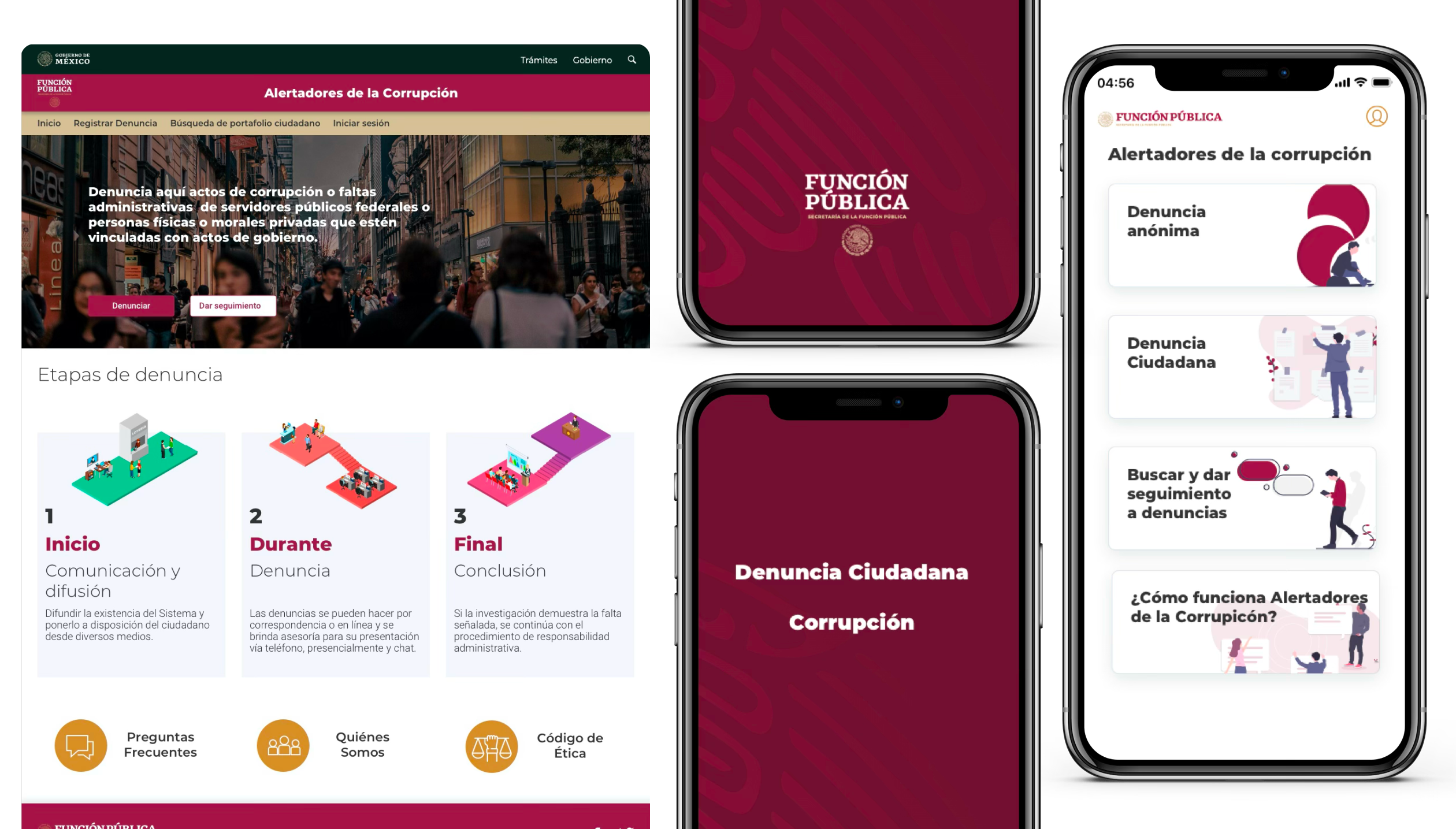
A website for citizens to report corruption and administrative misconduct by government officials. The central UX challenge was a 5-step multi-step form — one of the highest-friction flows to design well.
The system's stepper component and validated form fields did the structural work. The design challenge shifted from "how do we build this form" to "how do we reduce cognitive load across five progressive steps."
A job search platform for government employment opportunities. Two distinct user flows — search and discovery for job seekers, and a registration path for applicants — required the same components to answer very different interaction modes.
Search used buttons, dropdowns, and results list components. Registration used the same form fields as Denuncia Ciudadana, with modals for confirmation states. Same components, entirely different composition.
A mobile app for citizens to report authority abuse anonymously, with geolocation capability. The constraints of mobile required adapting every component to touch targets — bigger tap areas, more generous spacing, simplified steppers — but the component logic was unchanged.
The fact that mobile used the same conceptual components as the two web products was the clearest validation of the system: the same structural decisions scaled across screen sizes without requiring a parallel design process.
"A design system doesn't finish
before the first product.
It co-evolves with it."
The SFP stakeholders reported a 20% increase in form completion rates compared to the legacy versions. But the quantitative metric understates what actually changed.
The three products looked like they came from the same family. Not because they were visually identical — they weren't — but because they shared the same structural logic, the same component decisions, and the same interaction patterns. Users moving between products didn't have to relearn anything.
Before the system, conversations between designers, POs, and developers required constant translation — "the blue button in Denuncia" versus "the primary action in Trabaja." After the system, the vocabulary was shared. Decisions were faster because the reference was clear.
Three products in three months versus an estimated nine months working sequentially without a system. Design stopped being a bottleneck and became an accelerant.
Product owners had a new kind of question they could ask: "Should we use the existing Modal component here, or does this case need something new?" That question — whether to reuse or extend — is the right question. Without a system, it never gets asked.
The gaps in Publik are gaps that matter. Naming them precisely is worth more than burying them.
Time pressure is real. Three months for three products is genuinely tight. But "we didn't have time" is only half an explanation — the other half is understanding what the prioritization cost, so that next time, the tradeoff is made consciously.
No keyboard navigation testing. No color contrast audit. No ARIA labels built into components. In Mexico, accessibility isn't legally required for government products — but that's not the point. A government service should be the benchmark, not the exception. Accessibility should have been a design constraint from day one, not a "future release" item.
The design system lived in Figma. The Denuncia Paisano app developers had a native standard to work from — but there was no React or web framework equivalent. We only managed a basic CSS utility library. A parallel web components track would have closed the gap between spec and implementation.
The 20% improvement in form completion was measured against legacy baselines, not against user testing of the new system. We never tested whether citizens understood the stepper, found the error messages clear, or felt safe submitting anonymous reports. Business metrics confirmed the direction — they didn't validate the design.
Publik sits differently from other projects in my portfolio because the success metric was different. In a product project, success is measured by the outcome you want to generate in users. In a system project, success is measured by whether other people can build products faster and more coherently.
The design system's job was to not be noticed. When teams design from a shared system and the products feel consistent, users don't see the system — they see three coherent government services. That invisibility is the goal. And it's also why system work is hard to explain: the success case is the absence of visible problems.
Accessibility from day one, not a future release. A parallel CSS library track. Both feel like "nice to haves" under time pressure — and both are wrong to defer in a government context. The next time I build a system for a public institution, those two items are non-negotiable scope, not conditional scope.
A design system in a startup is about component reuse. In a large organization like Scotiabank, it's about consistency across dispersed teams. In government — in Publik — it was about something else: the ability to scale public services without multiplying design effort proportionally. Understanding which kind of system you're building changes every decision, from what to prioritize first to how you measure whether it worked.
Publik wasn't a beautiful system. It was a capable one. For three products in three months for a government agency with no digital design baseline, capability was the right goal.