Full anatomy — Canvas Page Template, all slots active
A structural solution for the one paradigm Redwood didn't have: visual builders. Delivered in one design cycle. Adopted by 7+ product teams across Oracle's enterprise ecosystem.
Redwood had a mature library of page templates. All of them shared the same baseline assumption: users organize data in lists, edit items, track states. That was the right model for most Oracle products.
But when several product teams started migrating to Redwood, something didn't fit. They were building products of a fundamentally different nature — email editors, site builders, automation flows, agentic workflows. No existing template served them.
The pattern became clear when I analyzed the incoming requests in parallel: different teams, different products, same underlying problem. They didn't need data in lists. They needed a surface where their users could build things visually.
The challenge had two dimensions: visual capabilities — drag & drop, contextual editing, zoom and spatial navigation — and flexible configuration across 7+ product teams without rebuilding from scratch each time.
Before designing any layout, I needed to understand the right mental model for this type of interface. I ran my own competitive benchmark — not to copy what already existed, but to justify design decisions with concrete evidence rather than following the obvious visual builder pattern.
The benchmark revealed a metaphor that unified every case: the paste-up desk — the editorial designer's workspace before digitization. A surface where any element could be placed, moved, and recomposed freely without a predefined structure. This is the exact mental model behind Figma, Miro, and Salesforce Flow. Naming it from the start aligned the team and stakeholders before the first proposal.
Five patterns appear consistently across Figma, Canva, Google Slides, Mailchimp, and Draw.io — regardless of what the product builds.
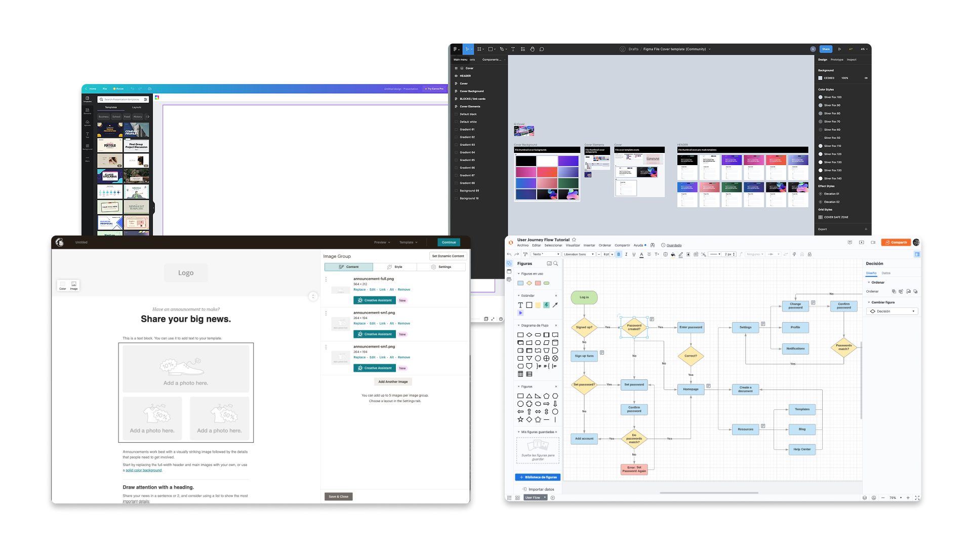
Minimal chrome. Only essential identity and primary actions — leaving the screen for the canvas.
Mode controls. Actions that change how the canvas responds to user input.
Element-level configuration. The most recurring pattern: select something, edit its properties.
Collapse chrome, hide panels, enter a clean state for focused review and presentation.
Interaction shortcuts. Quick access to actions without opening a full panel.
When I reviewed use cases from the requesting teams, I initially grouped them as a single category. The benchmark revealed something more precise — the reference tools weren't generic, each focused on one of two distinct paradigms.
Infinite canvas, connected nodes, pan & zoom navigation. Users construct flows and relationships. The spatial logic is relational — elements exist in reference to each other.
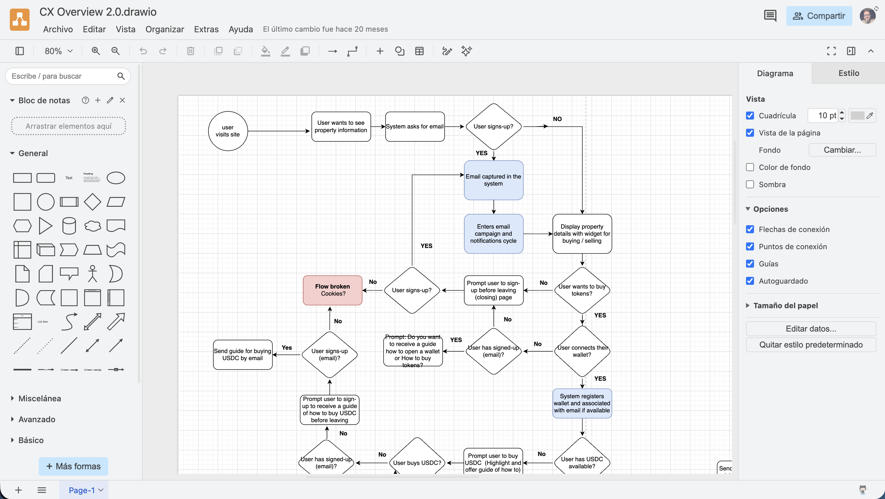
Bounded canvas, drag & drop of modules from a panel, properties in a lateral panel. Users assemble content in a defined space. The spatial logic is compositional — elements exist within a fixed container.
These weren't decorative mission statements. Each one resolved a real tension that came up during design and stakeholder reviews.
Shared principles gave the team a common language to evaluate trade-offs — and gave product teams a clear rationale for what the template would and wouldn't accommodate.
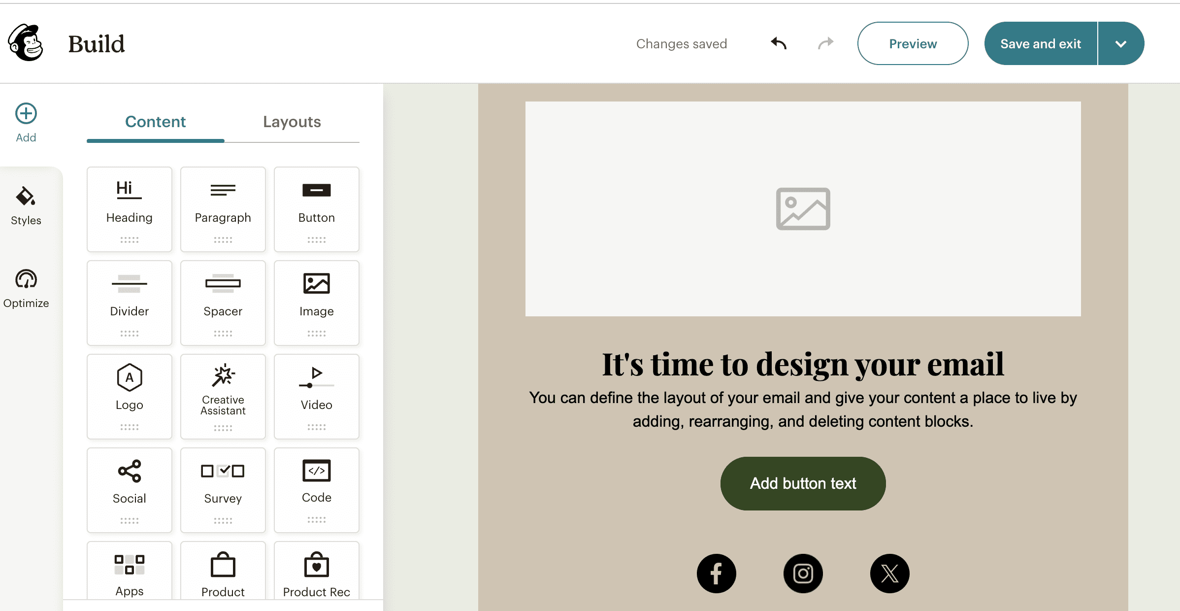
Every screen slot has a specific meaning. The UI organizes consistently — no ambiguity about which zone does what. Each area earns its space.
The canvas is the protagonist. Toolbar and header are deliberately thin — giving the maximum amount of screen real estate to the building area.
The template supports different use cases and defines a clear evolution path for more complex flows — without requiring a rebuild for each new product.
The layout was constructed cumulatively — adding each zone only when its function was clear. This sequencing became part of how the template was documented and communicated to adopting teams.
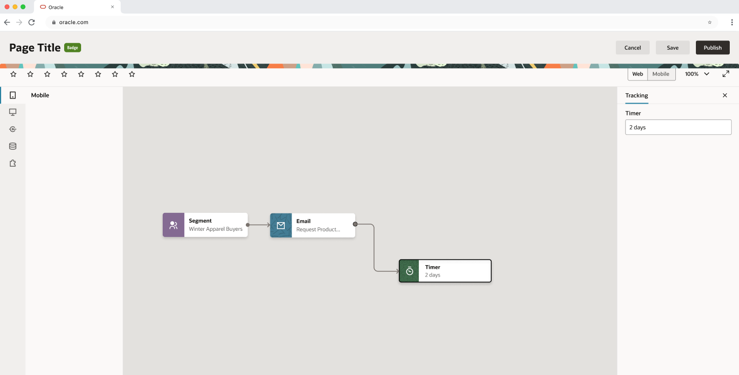
A lightweight version of Redwood's standard header. Contains the page title, a status badge, and primary actions (Cancel, Save, Publish). Nothing else. Any additional element competes with the canvas.
Divided into two zones with distinct logic. The left zone has up to 8 configurable action slots — whatever is relevant to the adopting product. The right zone is fixed: viewport toggle (Web/Mobile), zoom level, expand to full screen. Always in the same place, visible or hidden depending on what each product needs.
Collapsible panel with vertical icon-mode tabs. This is the origin zone — where the user selects or drags elements to place on the canvas. When collapsed, the icons remain visible as reference without consuming space.
Contextual editing when a canvas element is selected. Unlike the left panel, this is not collapsible — it is closeable. It disappears when nothing is selected and is reinvoked by selecting an element. Horizontal tabs support multiple property categories without overwhelming the user.
The area where visual construction happens. The largest space on screen — and the reason every other slot exists.
Side panels are useful when the user needs them. They are obstacles when they don't. The solution: a visibility-on-demand model. Users can collapse the left panel and close the properties panel, maximizing the canvas. Panels are invoked only when there is a specific action to perform.
This behavior required the most negotiation with product teams. The conversation shifted when I framed it as a template advantage: slots are defined, rules are clear, and within those limits there is room for configuration. What they cede in layout specificity, they gain in adoption speed and cross-product consistency.
"Template design is part design systems work
and part diplomacy."
Responsive behavior is not just about reducing sizes — it is about defining what to prioritize when space compresses. The canvas is always the last thing to give up space.
At medium breakpoints (768px), the right toolbar consolidates viewport toggle and zoom into a single dropdown. At small breakpoints (600px), lateral panels yield their space to the canvas entirely — construction simplifies, but the canvas remains functional.
Documenting this with precision was part of the deliverable to product teams: not just the ideal-state design, but the behavior under real-world conditions.
The alignment process with product teams was as much a part of the work as the design itself. Each team arrived with their own requirements, their own ideas about how their panels should look and what actions their toolbar should have.
The key was justifying each slot by its function, not by aesthetic preference. When teams understood the why behind each layout zone — why the header is slim, why the toolbar has two zones, why the properties panel is closeable but not collapsible — the negotiation shifted in tone.
It stopped being "this is how I designed it" and became "this is how the paradigm works, and within it you have room to configure what you need."
In no case did a team lose functionality they needed. What they ceded was layout specificity. What they gained was adoption speed and coherence with the rest of the platform.
The Canvas Page Template created a shared language for visual builders across Oracle — a baseline that proved the paradigm works inside Redwood.
Teams no longer start from zero. The slots are defined, the rules are clear, and there is room for configuration within a coherent system — email marketing, automation flows, site building, and agentic workflow design, all under the same structural logic.
Working at this level of page template — in direct contact with multiple product teams with different requirements — taught me something unexpected. The most valuable skill was not defining the anatomy. It was learning to make different teams recognize their use cases within a common proposal — and helping them understand that what they ceded in specificity, they gained in speed and coherence.
I would document the Diagrams vs. Builders distinction as a template architecture decision from the start, with their own usage guidelines. They currently coexist within the same template as sub-patterns — which works, but isn't explicit enough for adopting teams to know which applies to their case without consulting.
The current model defines fixed zones — left panel, right panel, toolbar. But there is a category of more complex products where users need to control their own workspace: floating panels, stackable panels, custom configurations that persist between sessions.
That is the natural direction of evolution. The Canvas Page Template is the baseline — the starting point that demonstrates the paradigm works inside Redwood. The next conversation is about how far it can flex without losing the coherence that makes it adoptable in the first place.