Before: 6 disconnected systems · After: unified onboarding + product marketplace
Six disconnected systems that a branch executive operated in parallel, turned into a single omnichannel origination tool. Led from the inside when the design director left — with a team that had been together for less than a month.
October 2019: I'm promoted to UX manager for digital products. November 2019: a new DGA arrives with a clear vision — unify the bank's origination systems, starting with branches. January 2020: the UX Director leaves Scotiabank.
At that point, one of the most ambitious projects in Scotiabank's Digital Banking division had no design director. It had a team that had been together for less than a month, a four Program Increment roadmap, and me as the connection point between design, product, and technology.
My work on OneBank had two inseparable dimensions: design the system and build the team that would make it possible. Neither could wait for the other to finish.
I acted as interim design director — working side by side with the product and technology directors, reporting strategy directly to the DGA — until the new design director arrived.
It wasn't the plan. But it was what we needed.
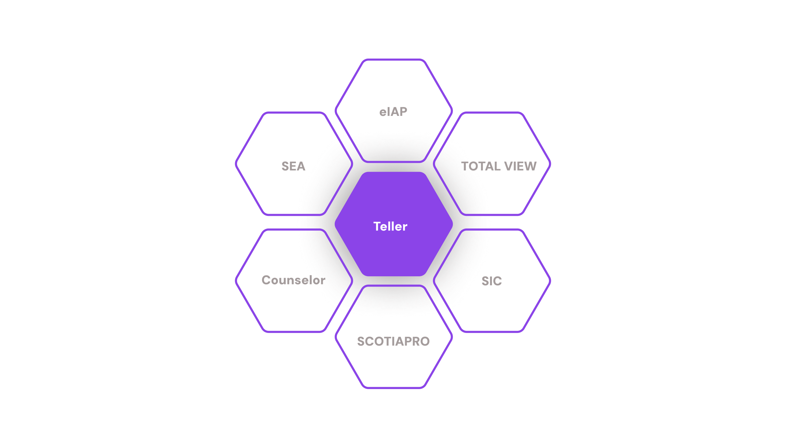
The current state of branch origination was, in practice, a teller window problem. When an executive wanted to open an account, offer a credit card, or sell insurance, they had to navigate between multiple tools: SIC, TOTAL VIEW, eIAP, SEA, COUNSELOR, SCOTIA PRO. Systems that didn't talk to each other, with different logic, that asked for the same customer data over and over again.
The bank's data revealed something that completely changed the strategic conversation. 65% of sales happened in branches. Only 20% were digital sales — one of our KPIs as Digital Banking. The remaining 15% was call center and other channels.
If we built solutions for the branch, branch sales would become digital sales and jump from 20% to 85%. The branch was the most powerful channel the bank had, and it was being underserved by fragmented systems.
But behind that number was a deeper problem. Legacy systems created friction in the daily work of account executives, and that friction had a visible cost for customers: longer wait times. A complete redesign of the digital experience was the lever to solve both things at the same time.
Working with the research team, we ran workshops with 16 executives from 5 territories — with experience ranging from under a year to more than eleven. They confirmed the problem with brutal clarity: the systems weren't efficient. Executives had learned to deal with them, but that translated into more time per process.
The findings split into two sets that structured everything that came after: what was painful today, and how they imagined a tool that actually helped them would work.
"I have to keep several systems open, and when one crashes I have to restart the machine."
"It should be able to use information already captured. One application for everything — no switching systems, no asking for data again."
Executives couldn't move forward without a system responding. A failure at any point froze the customer interaction entirely.
Multiple open windows, multiple simultaneous flows. Serving the customer competed with managing the systems.
The hardest flows simply weren't used. System complexity actively discouraged selling certain products.
The four attributes executives described became the design principles for OneBank.
That knows what the other knows. Information captured at one point is available everywhere else — without asking again.
One application for everything. No parallel systems, no context switching, no restarting the machine when something fails.
That recognizes both customer and executive. The system knows who the customer is before the executive starts asking questions.
That guides, not obstructs. A system that reduces the executive's cognitive load instead of adding to it.
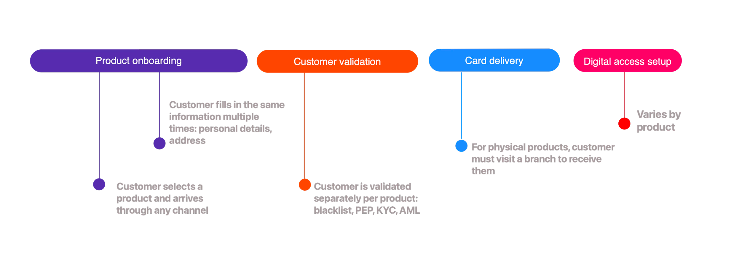
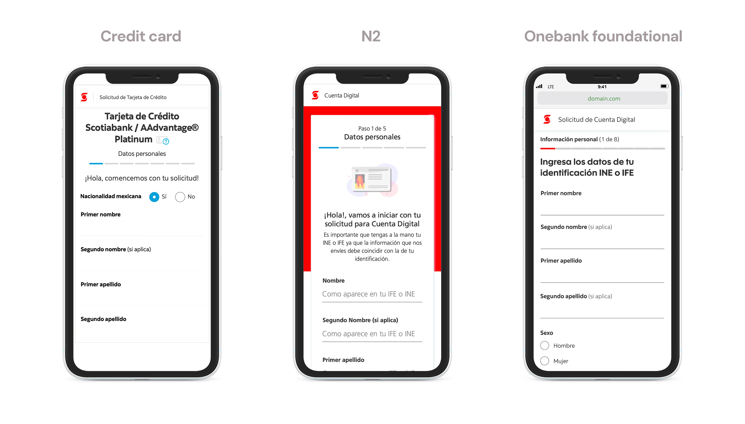
The traditional origination model at Scotiabank was product-first: a customer arrived asking for a credit card, and the executive opened the TDC flow. If that same customer also wanted an account, the executive opened another flow — and asked for name, RFC, address, phone number all over again.
The question that changed the model was: why do we ask the customer for their information based on the product, if the customer's information is always the same?
The executive requests data from scratch depending on the product chosen
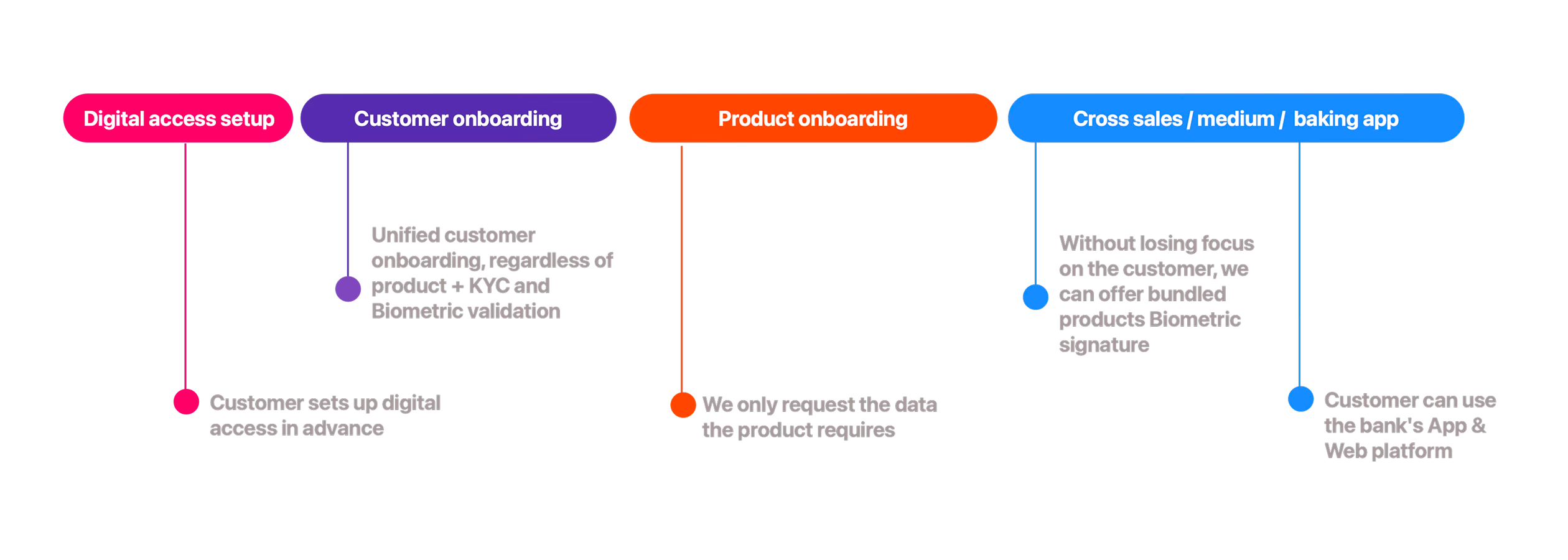
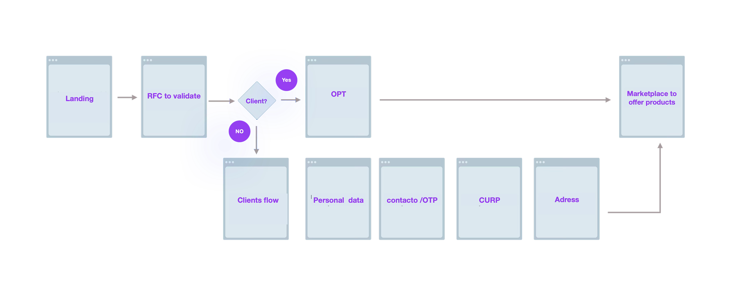
The answer was OneBank Foundational: an onboarding structured as independent modules that composed based on what each product required. Once the flow was complete, the customer was validated — and each product only asked for the specific information it needed, without re-asking what the system already knew.
One of the most revealing exercises was mapping the forms across all products to understand what data they had in common and why each field was being asked. Analyzing Insurance, N2, TDC, and Pre-approvals showed that personal data was nearly identical across all of them — but each product asked for it differently, in a different order, with different validation logic.
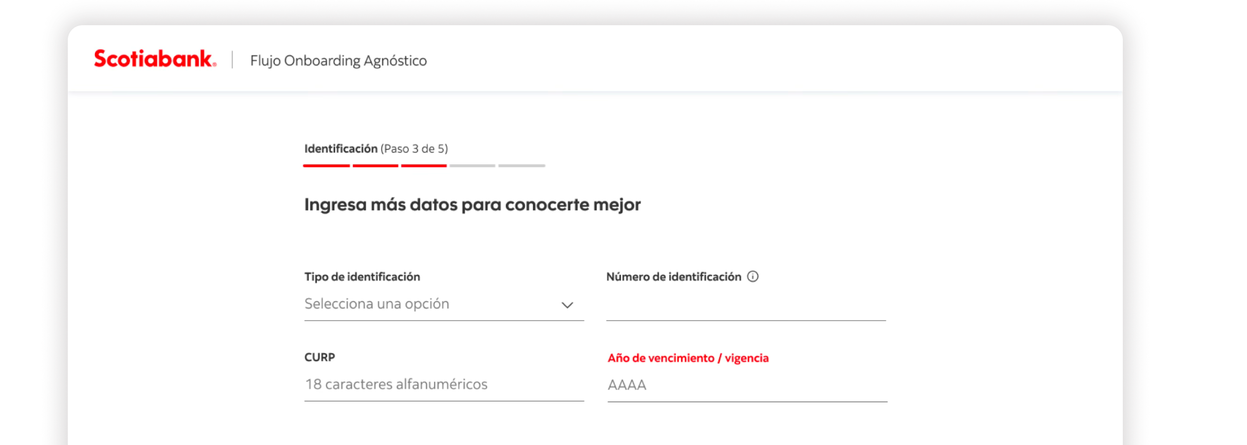
The clearest case was identification. The credit card asked for country of birth, state, gender, and INE expiration date. But all of that data can be derived from the CURP.
The decision was to design one standard path: ask for the CURP and derive the data. That looks like a technical decision — but it's really a design decision: make the customer fill in fewer fields and click less.
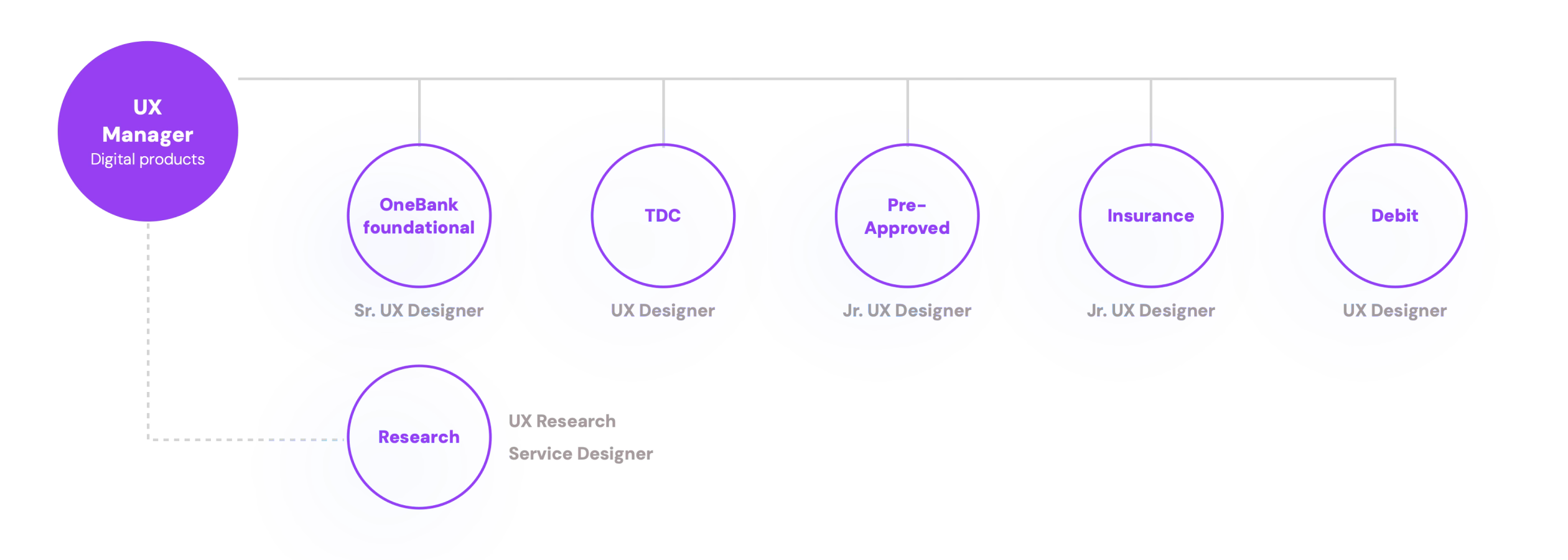
The OneBank design team had been together for less than a month when the project started. A Sr. UX Designer leading Foundational Onboarding, two UX Designers working on credit and debit cards, and two Jr. UX Designers responsible for Pre-approvals and Insurance. A UX Researcher and a Service Designer completed the team for the research track.
My job as lead wasn't to design. Although in practice I had to, my real responsibility was creating the conditions for the team to design well.
Not to review deliverables — to map individual needs, catch blockers before they became problems, and understand how each person operated best. A Jr. designer who doesn't know how to ask for help can stall an entire sprint if nobody notices in time.
Designers, researcher, and service designer in the same room reviewing explorations, discussing decisions, and defining reusable solutions. The goal wasn't just alignment — it was building a shared language across all tracks of the project.
The most important decision in the ideation phase was designing patterns before complete flows. If we defined a stepper step template correctly, all four products could adopt it without redesigning it. That's what made parallel progress possible.
OneBank's design divided into two layers: the foundational flow that unified onboarding for any product, and the marketplace that appeared once completed — letting the executive offer and close any product without asking for data again.
Validates whether the customer already exists in the system. The Mexico residency field only appears if the product (like Insurance) requires it. The module doesn't ask what it doesn't need.
Mobile number and email to validate the user. The landline appears as an additional field only in TDC — invisible for all other products.
CURP as the single source of truth. Derived fields (state, gender, INE expiration) are pre-filled automatically or omitted depending on the product. Two paths: CURP first or data first.
Standardized with Google Maps geolocation. The optional N2 fields (city or town, address type) appear at the end without interrupting the base flow for other products.
We started reusing components, and the experiences — even with visual differences — began to feel more homogeneous in the data structure. It even started being reused across Web and Mobile channels. Systematically, we were unifying every moment of the experience.
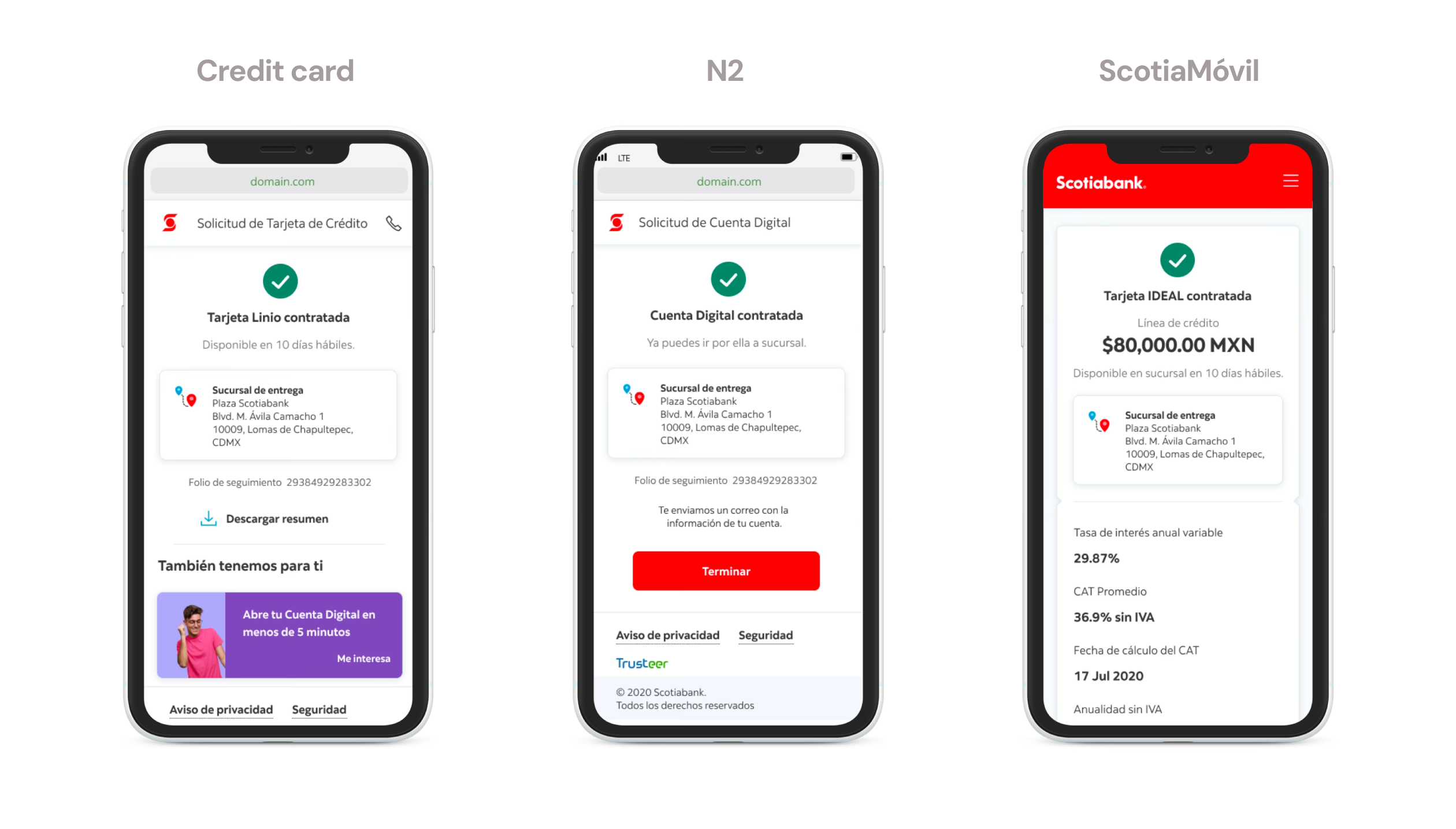
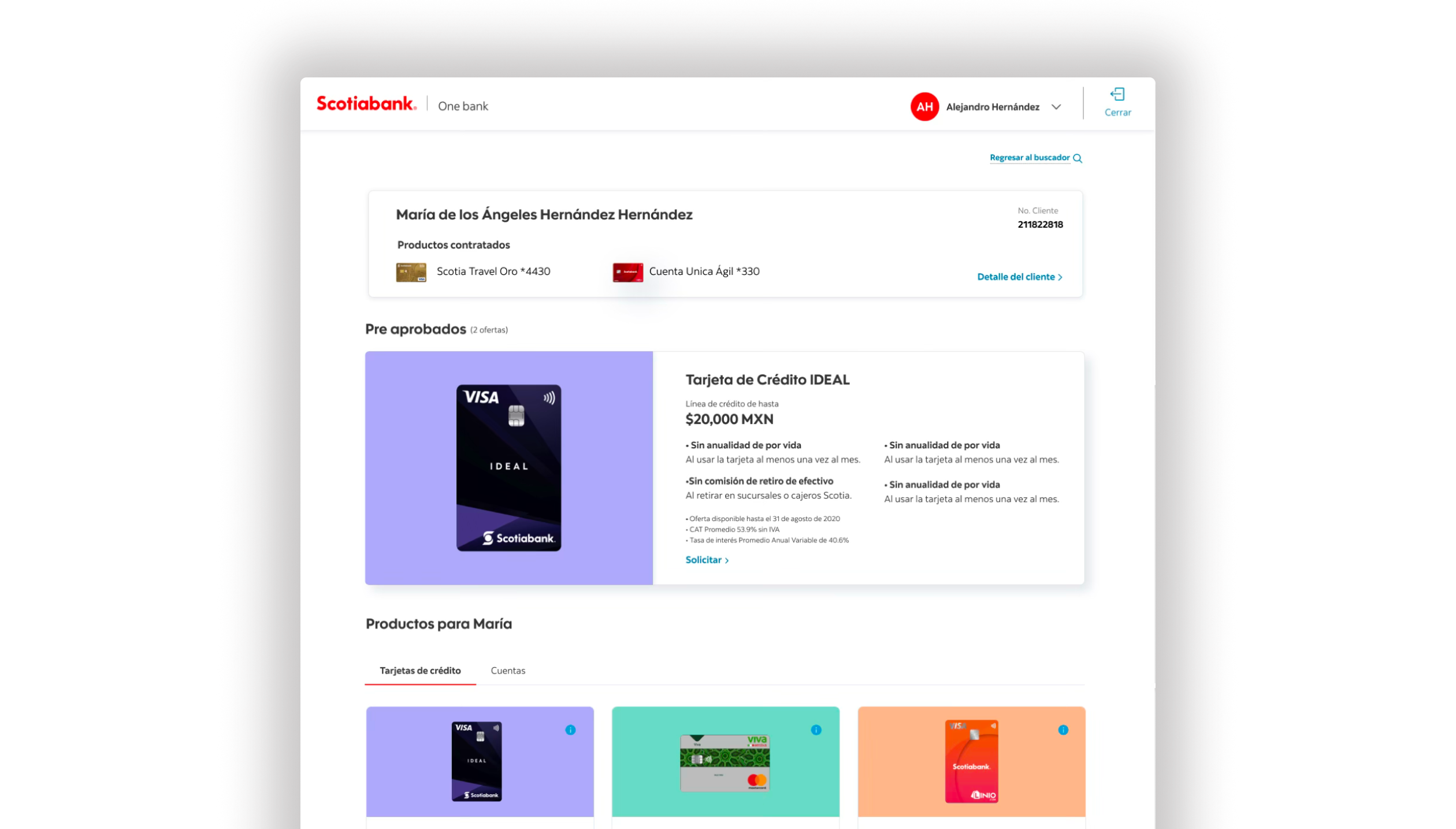
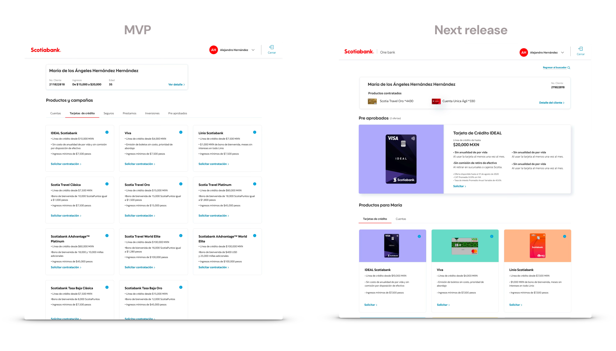
Once onboarding was complete, the customer arrived at a personalized marketplace — not at a specific product form. The executive saw the customer's pre-approved products with credit lines already calculated, and could start contracting any of them without asking for data again.
The MVP showed the product list. Release 2 added pre-approvals in the foreground, the customer profile with already contracted products, and navigation by category: Cards, Accounts, Insurance, Loans.
The executive's screen and the customer's screen converged in the same session. The bank as a personalized marketplace for each customer.
The biggest breakthrough in form simplification didn't come from a design decision — it came from the risk team, who helped us question whether certain fields were actually required by regulation or just by habit.
Making the case for why a workshop with 16 executives was necessary before writing a single screen was a conversation I had several times. The results justified it — but getting that space was also part of the work.
The Lego model of CIF + Products (OneBank Foundational) was one of the most valuable findings of the project — but it emerged during design, not as a starting point. If I had formalized it as an architectural principle in week one, it would have been easier to sell to product and technology from the beginning.
And I would have involved backend and risk teams in the initial workshops — not just as validators, but as co-designers of the problem.
OneBank was the foundation of a longer transformation. The unified onboarding solved the entry point — but the real potential was in what came after: an executive who, once onboarding was done, could offer any product in the bank without friction, with customer information already validated and pre-approvals calculated in real time.
I left the bank when Pre-approvals was in implementation and TDC hadn't started yet. The Release 2 vision was beginning to take shape. Getting there was a negotiation between IT, stakeholders in branches, and the product owners — a conversation that was well underway.