Cover — Medradr · Interaction Pattern Library · 2016
The brief was a demo video for investors. However, before animating a single screen, I had to build the system that would make it possible: an interaction pattern library that documented the motion language of the entire platform and served as a reference for the development team.
The initial goal was pure production: animate screens in After Effects to create a demo that felt real. I worked directly with the CEO and in parallel with the UI designer responsible for visual identity and screen design. My scope covered everything from the structural definition of the app — flows, wireframes, navigation architecture — to the final motion design.
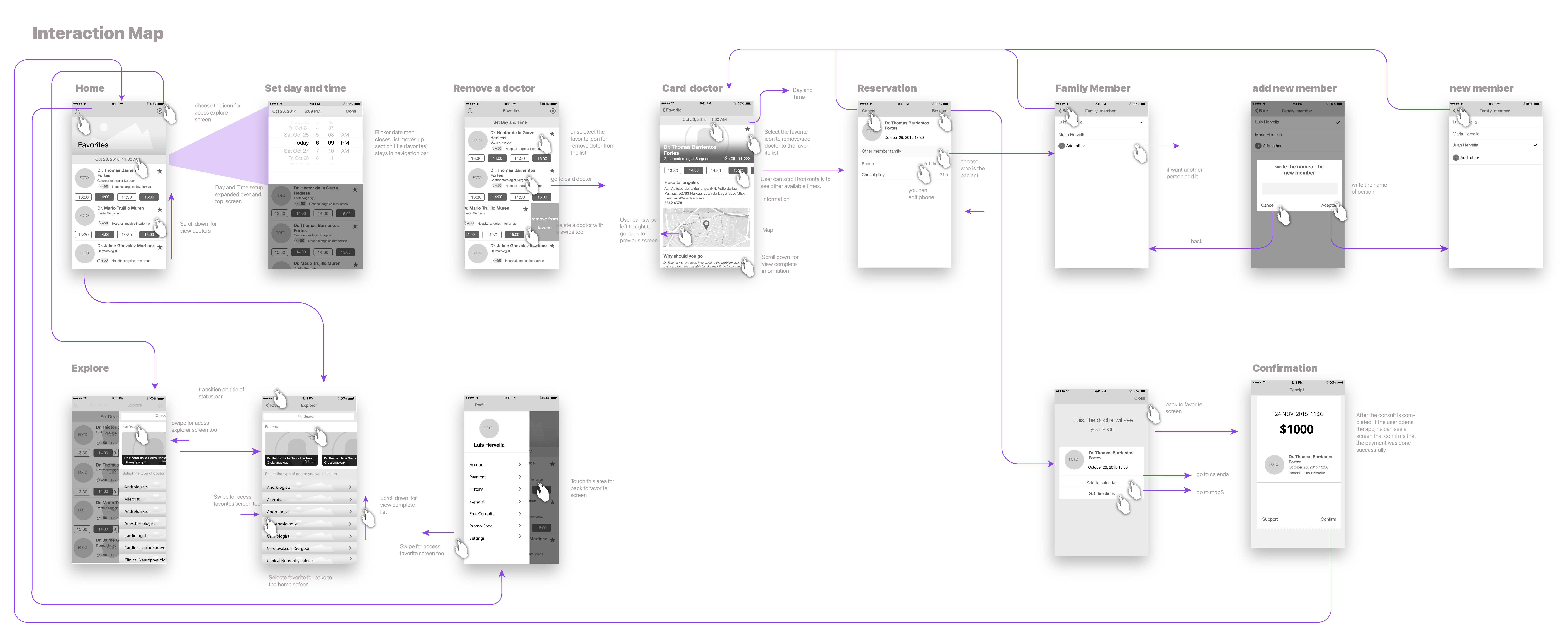
The first thing I did was map the complete user flow to understand which screens I needed to animate and in what sequence.
Animating with precision forces constant decisions: how does this screen enter? With what curve? What happens to the status bar on scroll? Without shared criteria, motion becomes arbitrary — and conversations with the team inevitably subjective.
The solution was to take a step back before animating: define the principles first.
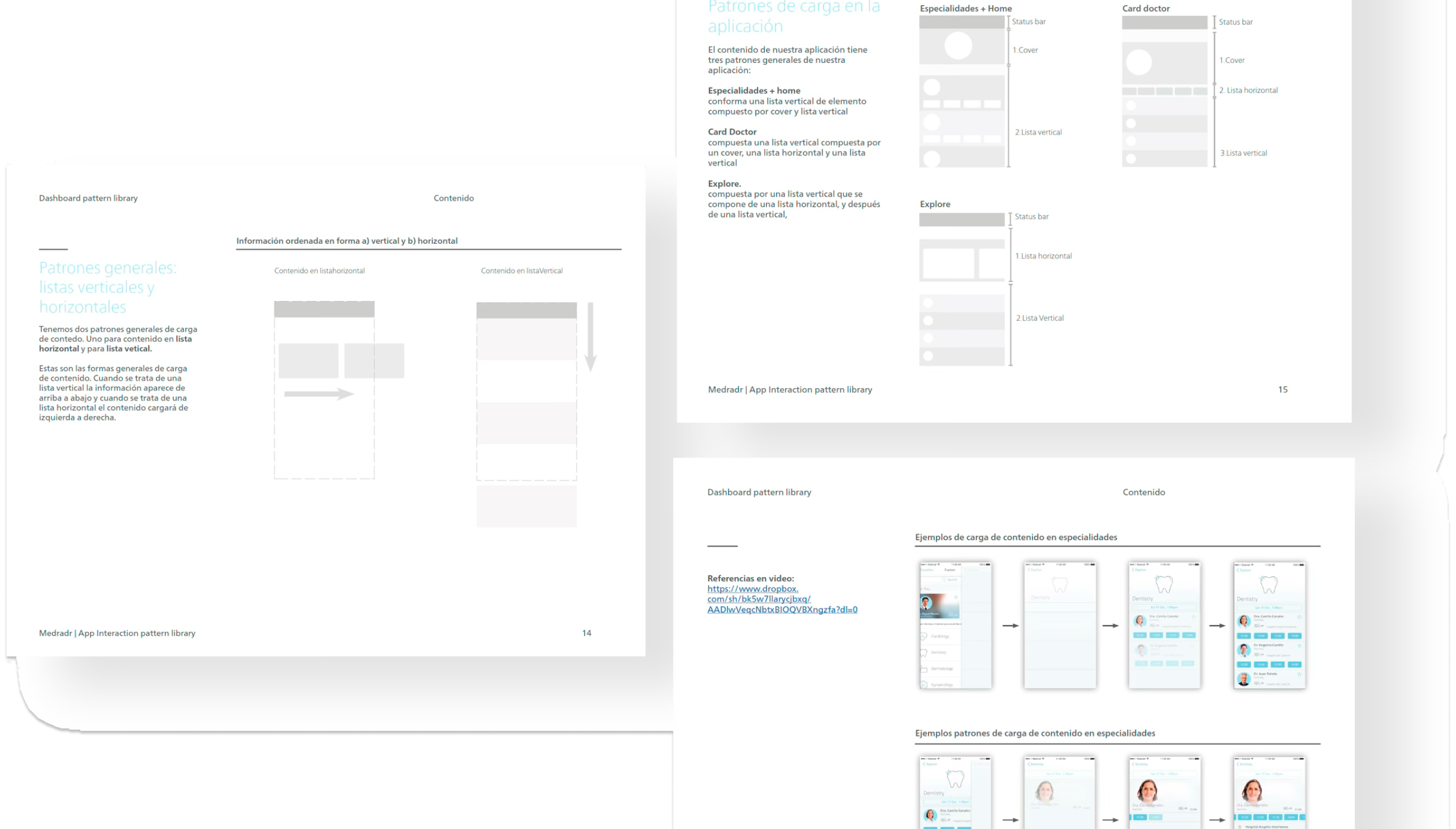
I proposed building an interaction pattern library before producing any animation. The goal wasn't to document for documentation's sake — it was to establish a shared language that allowed decisions to be made from design criteria rather than personal preference. This mattered especially because the app would be built by an external development team: without explicit rules, every screen could be interpreted differently.
The library was organized into five categories. Each one with its own defined pattern, documented curves and timing, and a clear rationale.
Communicate the application's status and give users clear feedback about what's happening at every moment.
Reinforce the sense of direct manipulation: the user should feel they're in control of what happens on screen.
Show users the result of their actions clearly and immediately. No ambiguity.
Navigation between sections works through stacked depth levels: each new screen slides over the previous one, creating a clear sense of hierarchy. The swipe-back gesture responds in real time to finger movement, and the status bar fades in and out in sync with the gesture. Reserve is the only flow with independent navigation — it appears from the bottom up, signaling that it's a shortcut, not part of the linear flow.
Content loading follows two general patterns: vertical lists that load top to bottom, and horizontal lists that load left to right. Each main section has its own defined pattern based on what the user needs to see first. Specialties + Home, Card Doctor, and Explore have distinct structures that answer that question before showing any data.
Modals appear outside the normal navigation flow to communicate one-time messages: location permissions, contact access. They leverage background blur with an opacity layer to visually separate from context without breaking the continuity of the experience.
Components are selection controllers — like the date picker for choosing appointment date and time. Its expand animation uses an alpha layer to maintain context visibility while the user interacts with the selector.
The animated loading icon represents a pulse of life — intentionally aligned with the app's medical context. It's used in two distinct moments: as a placeholder during the initial data load, and as an intermediate state when the app needs to refresh information between screens.
With the patterns defined, the motion in the videos wasn't a series of arbitrary decisions — it was the consistent execution of a system. Every transition, every content load, every gesture responded to criteria that had already been established. That's what gives a demo visual coherence: not the style, but the consistency of the behavior.
The video covers the complete flow from the patient's perspective: from the home screen to appointment confirmation. It was the centerpiece of the presentation that helped Medradr close its first funding round.
The second video shows the experience from the doctor's side — a calendar and patient management app. Same interaction system, different perspective.
Medradr secured investment and launched operations. The project closed a year later. The interaction library remained as a reference for the external development team throughout the build phase.
The library wasn't just documentation for the external development team — it was the argument that made it possible to make decisions from design criteria rather than personal preference. Every transition in the demo video had a reason to exist. And that reason was written down.
This project made me understand that motion design isn't decoration. It's communication. Every transition tells the user where they are, what just happened, and what they can do next. Working from explicit principles rather than intuition changed the way I think about interaction — and it still does.
I also learned that systematizing before producing isn't wasted time. It's what makes it possible to scale without losing coherence, and what moves design conversations out of the space of personal preference.
The team prioritized production and polish over validation. A mid-fidelity prototype with real user insights would have been far more valuable in early stages than a highly produced video without having tested the value proposition with actual users.
The interaction library arrived at the right moment for the video. However, that work would have had far greater impact had it also informed product decisions from the beginning.